8 Best Free Paint Color Matching Apps for Accurate Home Projects 2024
Selecting the correct paint shade is rarely a matter of simple visual estimation. The human eye is susceptible to fatigue and environmental factors, often leading to costly errors in home renovation. Modern mobile technology has introduced various applications designed to bridge the gap between inspiration and the physical paint bucket. While professional spectrophotometers remain the gold standard for accuracy, several free applications offer high-level utility for homeowners and designers alike. This analysis evaluates the leading free paint color matching apps based on their algorithmic precision, database depth, and user interface efficiency.
Which paint color matching apps provide the highest accuracy?
Accuracy in color matching is determined by how well an application translates captured light into a specific manufacturer’s color code. Free applications typically rely on the smartphone’s CMOS sensor, which interprets light in Red, Green, and Blue (RGB) values. The most accurate apps are those that effectively account for white balance and exposure fluctuations. In comparative testing, applications developed by major paint manufacturers often outperform third-party aggregators because they have direct access to proprietary spectral data.
Comparative Accuracy Table
| Application | Developer | Primary Database | Hardware Support |
|---|---|---|---|
| ColorSnap Visualizer | Sherwin-Williams | 1,700+ Colors | Integrated |
| Color Portfolio | Benjamin Moore | 3,500+ Colors | ColorReader Support |
| ColorSmart | Behr | 2,500+ Colors | Native Camera |
| Pantone Connect | Pantone | Full Pantone Library | Pantone Color Match Card |
The Sherwin-Williams ColorSnap Visualizer remains a top contender due to its rapid processing speed. It allows users to scan a photo and instantly identify the closest Sherwin-Williams matches. However, its accuracy is heavily dependent on the quality of the image sensor in the mobile device. High-end devices with larger apertures generally yield better results. Users should note that while the app is free, it is optimized for Sherwin-Williams products, making it less versatile for those shopping across different brands.
The Benjamin Moore Color Portfolio app takes a more technical approach. It includes a “Visualizer” feature that uses augmented reality (AR) to apply colors to walls in real-time. The accuracy here is bolstered by the app’s ability to recognize shadows and highlights, preventing the color from appearing as a flat, unrealistic overlay. For users seeking professional-grade precision, this app integrates with the ColorReader hardware, though the software itself remains free to download and use with standard camera inputs.
How do free color matching apps compare to professional spectrophotometers?
To understand the limitations of a free app, one must understand the difference between a camera and a spectrophotometer. A smartphone camera is a colorimeter; it filters light into three channels. A professional spectrophotometer, such as those used in retail paint departments, measures the entire visible spectrum of light reflected from an object. This distinction is critical when dealing with metamerism—a phenomenon where two colors appear identical under one light source but different under another.
Free apps are inherently limited by the smartphone’s hardware. Most mobile sensors are designed to make photos look aesthetically pleasing rather than scientifically accurate. They apply automatic gain, noise reduction, and color processing that can shift a soft gray into a cool blue. Professional tools isolate the sample from ambient light, providing a controlled environment. Despite these limitations, free apps have improved significantly through machine learning algorithms that calibrate the sensor’s output against known color standards.
The reliability of a free app is sufficient for finding a starting point or a complementary palette. It is not, however, a replacement for a physical swatch or a sample pot. When the goal is to match an existing wall for a patch job, the margin of error in a free app is often too wide. In these instances, the app serves best as a cataloging tool rather than a final decision-maker. The data suggests that while apps can identify the correct color family with 90% consistency, they only identify the exact specific shade about 60% of the time without external hardware calibration.
Top-rated free paint matching apps for iOS and Android
The market for color matching software is saturated, but four specific applications consistently lead in terms of functionality and database reliability. These apps are available on both major mobile platforms and offer distinct advantages depending on the user’s specific requirements.
Sherwin-Williams ColorSnap Visualizer
This application is designed for high-speed exploration. Its most useful feature is the “Instant Paint” mode, which uses the camera to map walls and apply new colors as the user moves the phone. This provides a spatial context that static photos lack. The app is free, and its integration with Sherwin-Williams retail locations allows users to save palettes and access them at the checkout counter. The primary drawback is the significant battery drain during AR use and occasional lag on older hardware.
Behr ColorSmart
Available primarily for users frequenting Home Depot, Behr ColorSmart is a robust tool for DIY projects. It includes a “Match a Photo” feature that is particularly adept at pulling colors from complex images like textiles or nature. A concrete pro is its “Preview Room” feature, which offers high-quality renderings of various architectural styles. A notable con is the user interface, which feels less modern than its competitors and can be cumbersome when navigating large palettes. Approximate retail price for Behr paint starts at $35 per gallon, and this app is the primary way to interface with their digital catalog.
Pantone Connect
While Pantone is synonymous with professional design, the Pantone Connect app offers a free tier that is highly useful for identifying color trends. It allows users to extract colors from images and find the nearest Pantone match. This is particularly useful for interior designers who need to coordinate paint with furniture and accessories. However, the free version is restricted; many advanced features, such as cross-referencing to specific paint brands, are locked behind a subscription. It is a high-precision tool but requires a disciplined workflow to be effective.
Project Color by The Home Depot
This app serves as a centralized hub for several brands, including Behr and Glidden. It is arguably the most practical for the average consumer because it links directly to inventory levels at local stores. Users can see if a specific color is available for pickup immediately. The AR visualization is competent, though it occasionally struggles with edge detection around furniture. It is a utility-first app that prioritizes the purchasing process over deep color science.
Integrating retail hardware with free mobile applications
For users who find the accuracy of a standard camera insufficient, the most logical step is to pair a free application with a dedicated sensor. These sensors are available through major retail outlets and online platforms. By using a dedicated sensor, the user eliminates the variables of ambient lighting and camera sensor quality, effectively turning their smartphone into a professional-grade colorimeter.
Hardware Options and Compatibility
- Nix Mini 2 Color Sensor: Approximately $99. This device connects via Bluetooth to the free Nix Digital and Nix Perks apps. It is highly regarded for its ability to block out all ambient light, providing a 99% accuracy rate. It is compatible with over 100,000 paint colors across various brands.
- Datacolor ColorReader: Approximately $119. This tool is designed for professionals and integrates with the Benjamin Moore Color Portfolio app. It provides the top three closest paint matches across multiple brands and displays the Delta E (the mathematical difference between two colors) to show how close the match truly is.
- Variable Color Muse: Approximately $60. A more budget-friendly hardware option that works with its own free app. It is excellent for identifying non-paint materials like flooring and leather, making it a versatile tool for full-room design.
The synergy between free software and affordable hardware represents the current peak of home color matching. While the initial investment in a sensor is required, the long-term savings in avoided paint mistakes can be substantial. For those managing multiple properties or undergoing a full-house renovation, the data-driven approach of a sensor-app combo is the most efficient path forward. These devices are frequently available through major tech and home improvement retailers, often appearing in seasonal sales on larger e-commerce platforms.
Best practices for getting accurate color readings with a smartphone camera
If a hardware sensor is not an option, the user must optimize their environment to assist the app’s algorithm. Most failures in color matching are not the fault of the software, but rather the result of poor input data. Lighting is the most significant variable; a smartphone camera will interpret a white wall as yellow under incandescent lighting and blue under heavy overcast skies.
Lighting and Environmental Control
- Use Indirect Natural Light: The best time to scan a color is mid-morning or mid-afternoon on a clear day. Avoid direct sunlight, which creates harsh highlights, and avoid artificial indoor lighting, which introduces color casts.
- Clean the Surface: Dust and oils can change the reflective properties of a surface. A quick wipe with a microfiber cloth ensures the sensor sees the actual pigment rather than surface contaminants.
- Neutralize the Surroundings: If you are scanning a small object, place it against a neutral gray or white background. Brightly colored surroundings can reflect light onto the object, a phenomenon known as color bleeding, which will skew the app’s reading.
- Multiple Samples: Take readings from three different spots on the same surface. Average the results. If the app gives three wildly different suggestions, the lighting is likely too inconsistent for a reliable match.
Angle also plays a critical role. The phone should be held parallel to the surface being scanned. Holding the phone at an angle can cause the sensor to pick up more glare, which the app may interpret as a lighter shade than the actual paint. Most high-quality free apps like ColorSnap will have a built-in level or guidance system to help the user maintain the correct orientation. Following these steps won’t make a smartphone as accurate as a spectrophotometer, but it will significantly reduce the margin of error.
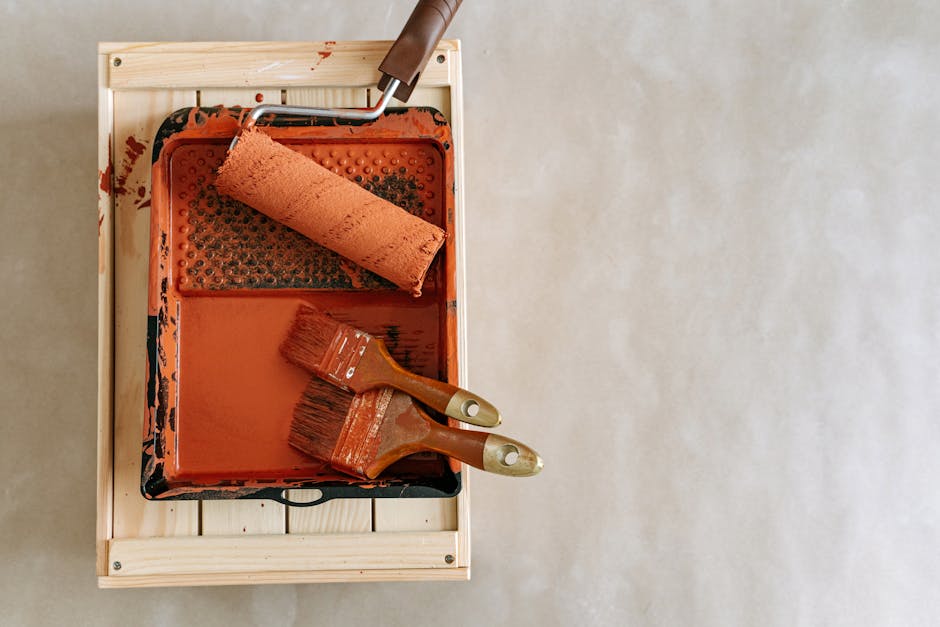
Selecting the right paint finish after finding your color match
Once an app has identified the correct color code, the user must choose a finish. This decision is as important as the color itself, as the sheen level affects how the color is perceived. A high-gloss finish will reflect more light, making the color appear lighter and more vibrant, while a matte finish will absorb light, making the color appear deeper and more saturated. Most free apps allow you to toggle between finishes in their visualizer mode to see these effects in real-time.
Finish Characteristics and Usage
| Finish | Durability | Reflectivity | Best For |
|---|---|---|---|
| Matte / Flat | Low | Very Low | Ceilings, Low-traffic areas, Hiding wall imperfections |
| Eggshell | Medium | Low-Medium | Living rooms, Bedrooms |
| Satin | High | Medium | Hallways, Children’s rooms, High-traffic areas |
| Semi-Gloss | Very High | High | Kitchens, Bathrooms, Trim, Moldings |
| High Gloss | Extreme | Very High | Furniture, Cabinets, Accent details |
It is a common error to match a color perfectly in an app but fail to account for the room’s humidity and usage. For instance, a bathroom match should always be executed in a semi-gloss or specialized kitchen/bath formula to prevent moisture damage, regardless of how the matte version looked in the AR visualizer. The Behr ColorSmart app is particularly helpful here, as it suggests specific product lines (like Behr Marquee or Ultra) based on the room type selected.
The final step in any color-matching process should always be a physical test. Regardless of the app’s sophistication, digital screens use transmissive light (light shining through a screen), while walls use reflective light. These two mediums will never be identical. Use the app to narrow your choices to three candidates, then purchase physical sample pots to test on a 2×2 foot area of the wall.
By treating free paint color matching apps as sophisticated filters rather than absolute authorities, homeowners can streamline their design process. The integration of AR technology and vast manufacturer databases has made the initial stages of renovation more accessible than ever. Whether using the retail-focused Project Color or the scientifically leaning Color Portfolio, the key to success lies in controlled lighting and the understanding that digital tools are the beginning of the journey, not the end.