Why you will probably regret that trendy navy blue kitchen cabinet color
Painting your kitchen cabinets is a special kind of hell. I’ve done it three times now—twice for myself and once for my mother-in-law—and every single time, I find myself standing in the middle of a gutted kitchen at 2 AM, covered in fine dust, wondering why I didn’t just pay a professional the $5,000 they quoted me. It is tedious. It is messy. And if you pick the wrong color, it is a permanent reminder of your own poor judgment every time you go to make toast.
Most of the advice you find online is written by people trying to sell you a specific brand or by designers who don’t actually have to live with the greasy fingerprints that show up on dark matte finishes. I don’t care about trends. I care about what looks good after six months of actual use. Most “best paint colors cabinets” lists are just recycling the same five Pinterest photos from 2026. They’re wrong. Or at least, they’re not telling you the whole truth.
The Great White Lie
Everyone says to go with white. “It’s classic! It’s timeless!” It’s also like living inside a hospital refrigerator if you get the undertone wrong. I used to think white was the safest bet. I was completely wrong. White is actually the hardest color to get right because it’s never just white. It’s yellow-white, or blue-white, or that weird pinkish-white that makes your floor look like raw ham.
If you must do white, stay away from the stark, “out of the can” whites. I tried 14 different white samples on a scrap piece of MDF in my garage back in 2026. I literally mapped them out with a sharpie and checked them at 8 AM, noon, and 6 PM. Benjamin Moore Simply White is the only one that didn’t make me want to scream. It has just enough warmth that it doesn’t feel clinical, but it isn’t yellow. But honestly? White is boring. It’s the “default settings” of kitchen design. It’s fine, I guess. But you can do better.
The navy blue mistake I made in 2026
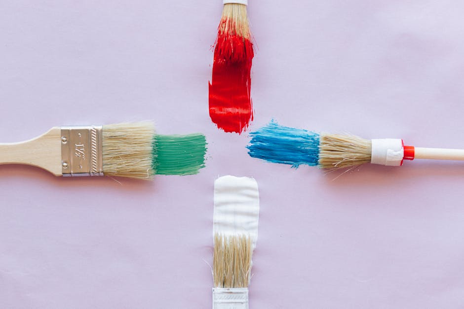
I know people will disagree with me on this, and I’ll probably get emails about it, but navy blue cabinets are the new “Live Laugh Love” sign. They are everywhere, and they are already starting to look dated. I fell for it. I painted my mother-in-law’s kitchen in Sherwin-Williams Naval because I saw it in a magazine and thought I was being bold.
What I mean is—actually, let me put it differently. It looked great for exactly one week. Then the reality of a dark, saturated color in a room with mediocre lighting set in. The kitchen felt like a cave. A blue, depressing cave. Every single speck of flour, every water drop, and every smudge from a sticky toddler hand looked like a neon sign against that dark blue. We ended up repainting the uppers two years later just so she could see her countertops again. Never again. Dark colors on bottom cabinets? Maybe. Dark colors on top? You’re asking for a claustrophobic breakdown.
If you’re dead set on a dark color, go with a muddy charcoal or a very deep forest green. At least those have some soul. Navy just feels like a corporate blazer.
The green phase (and why it actually works)
Right now, everyone is obsessed with sage green. For once, the internet is actually right about something. Green is the only color that manages to feel like a neutral while still having a personality. I’ve found that “muddy” greens—colors that have a lot of gray or brown in them—are the most resilient. They hide the fact that you haven’t wiped down your cabinets in three weeks.
- Farrow & Ball Pigeon: It’s expensive. It’s pretentious. But damn, it’s a good color. It shifts between blue, green, and gray depending on the light.
- Sherwin-Williams Evergreen Fog: A bit more “earthy.” It feels substantial.
- Benjamin Moore Saybrook Sage: This is for people who want a “cottage” vibe without it looking like a grandmother’s tea room.
Anyway, I digress. The point isn’t just the color; it’s the light. If your kitchen faces north, that beautiful sage green is going to look like cold cement. You have to paint a giant piece of cardboard and move it around the room for three days before you commit. If you don’t do this, you deserve the ugly kitchen you get.
The part nobody talks about: The Paint Brand
I’m going to say something that might be wrong, but it’s my truth: I hate Sherwin-Williams Emerald Urethane Trim Enamel. Everyone raves about it. Every pro painter on YouTube says it’s the gold standard. I think it’s a nightmare for a regular person to use. It dries so fast that if you try to go back and fix a drip after thirty seconds, you ruin the whole finish. It’s unforgiving and sticky.
I tested four different brands for leveling (how the brush marks disappear) in my unheated garage in October 2026. I tracked the cure time and the “fingernail scratch test” over 14 days. Benjamin Moore Scuff-X—which isn’t even technically a cabinet paint, it’s for high-traffic commercial hallways—performed better than the dedicated cabinet paints. It leveled out like glass. I’ve hit my Scuff-X cabinets with a vacuum cleaner head and they didn’t even chip. Total win.
A take that will probably get me in trouble
I refuse to recommend greige. I don’t care if it’s Revere Pewter or Agreeable Gray or whatever other boring name they’ve come up with this week. Greige is the color of indecision. It’s for people who want to sell their house in two years and are afraid of offending a potential buyer. If you’re living in your house, pick a color that makes you feel something. Even if that feeling is “I might have made a mistake with this terracotta,” at least it’s a feeling. Sanding is like trying to apologize to someone who isn’t listening; it’s painful and takes forever, so you might as well make the end result worth the effort.
I might be wrong about this, but I think the trend of “wood-look” laminate cabinets is going to make a comeback because people are getting tired of the maintenance of painted wood. But until then, we’re stuck with the brush and the roller.
Go with a muted, earthy green or a warm, mushroomy taupe (like BM Pashmina). They’re the only colors that don’t make me want to start over six months later.
Is it weird that I still have a physical reaction to the smell of primer? Probably. But that’s the price you pay for DIY. Just don’t pick navy blue. Please.