Open-Plan Living Color Palettes That Work
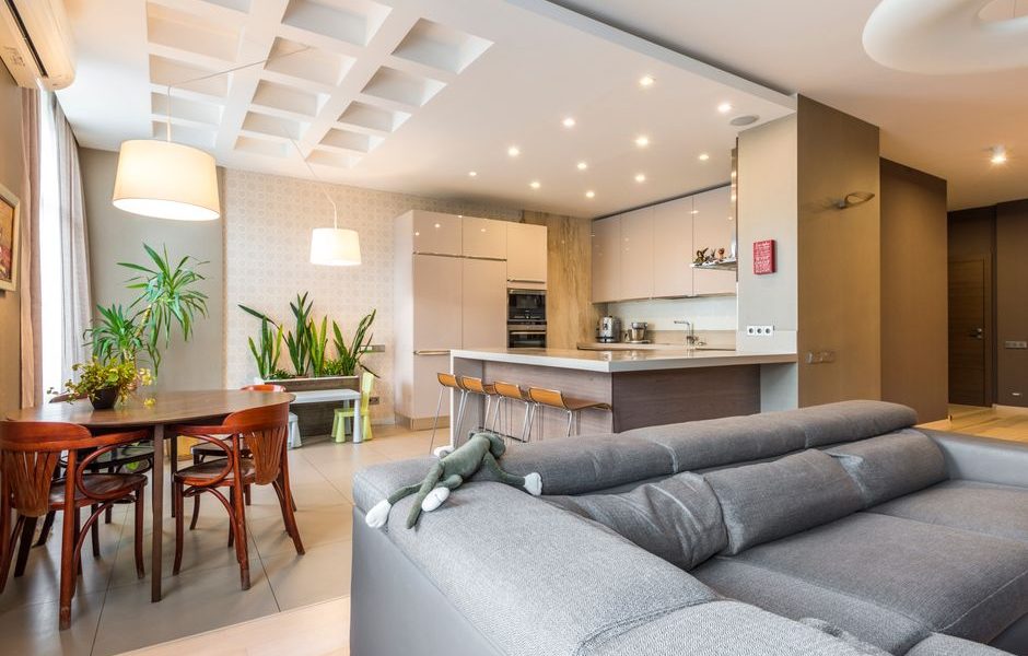
Open-plan rooms look simple until one paint color has to sit beside the kitchen, dining table, sofa, flooring, and several kinds of daylight. I have found that the best palette is not the boldest one; it is the one that makes the whole room feel connected while still giving each zone a clear job.
How to map an open-plan room before choosing color
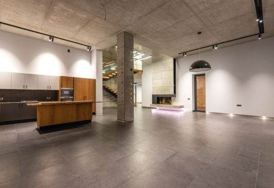
My verdict: map the room first, then choose paint. A color that looks perfect behind the sofa can turn muddy beside a bank of kitchen cabinets. Start by drawing the main sightline from the entrance. Mark every surface that remains visible from that point, including the far wall, ceiling, cabinetry, fireplace, built-ins, and large pieces of furniture. Those surfaces form one visual group, even if they belong to separate areas.
Find the fixed colors you cannot easily change
List the undertones in the floor, worktop, backsplash, curtains, and upholstery before you look at paint cards. Beige stone often carries yellow or pink; gray flooring can lean blue, green, or violet. Hold a plain white sheet beside each material to expose the undertone. The palette should repeat one of those quiet undertones instead of fighting it.
Track daylight across the whole day
Paint samples need to stay up for at least 24 hours. North-facing light can make warm neutrals look flat and cool colors look sharper. South-facing rooms add yellow light, which can push cream paint toward butter. Check the same sample at breakfast, mid-afternoon, and after the lamps come on. I make the final call at night because that is when many living rooms are actually used.
Give each zone a role instead of a random accent wall
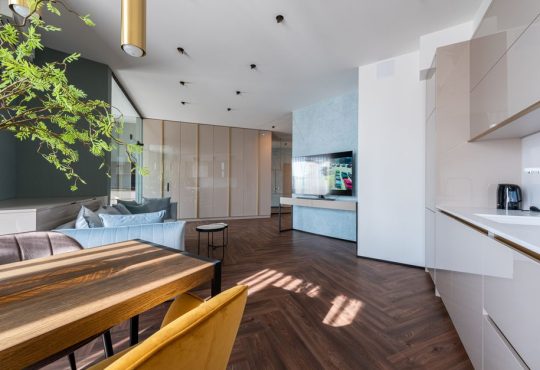
Use one dominant wall color across the longest sightline, then create separation through furniture, rugs, lighting, and small shifts in value. A dining area can become slightly deeper than the lounge, but the colors should share an undertone. The practical target is a palette with one anchor, one supporting neutral, and one limited accent. More than three strong colors usually makes an open room feel chopped up.
Keep the main walls quiet and let the layout provide contrast

My strongest advice is to avoid painting every open-plan zone a different color, because the eye reads those hard breaks as walls that do not exist, making the room feel smaller and more restless; a single pale neutral across the longest walls gives the space a calm background, while a darker rug, timber dining table, colored sofa, or pendant light can mark each activity without creating visual noise.
Use contrast where the architecture already changes: the kitchen island, a chimney breast, a shallow alcove, or the wall behind a dining bench can carry more depth than a random rectangle in the middle of the room; this keeps the palette tied to the structure and makes the room easier to furnish later.
If you want drama, put it on a movable surface first, such as a large rug, curtains, artwork, or a painted cabinet, because these elements can change when your taste changes; repainting a connected ceiling and several walls after a failed experiment costs far more time than replacing a cushion.
The clear winner for most open-plan homes is one continuous wall family with two measured changes in value, not a rainbow of unrelated shades.
Which paint colors link open-plan zones best?
My pick for most homes is a warm, restrained neutral with a clear undertone. These colors connect a living room to a kitchen without making every surface look identical. I would choose the paint line and finish after testing the color, because sheen changes how the same shade looks beside matte cabinetry, polished stone, or a television screen.
| Paint color | Specific product and code | Best open-plan use | Why it works |
|---|---|---|---|
| Alabaster | Sherwin-Williams Alabaster SW 7008, Emerald Interior Acrylic Latex in eggshell | Long walls and ceilings with warm flooring | Soft white that avoids a stark blue cast |
| Pale Oak | Benjamin Moore Pale Oak OC-20, Regal Select Interior Eggshell | Living and dining zones with beige or light wood | Light greige that shifts gently through daylight |
| Skimming Stone | Farrow & Ball Skimming Stone No.241, Estate Emulsion | Rooms with stone, oak, or cream upholstery | Warm stone tone with enough depth for trim contrast |
| Blank Canvas | Behr Blank Canvas DC-003, Premium Plus Interior Eggshell | Bright rooms needing a clean but warm base | Flexible off-white for cabinets, walls, and wood accents |
| French Grey | Little Greene French Grey 113, Intelligent Matt Emulsion | One dining wall or built-in cabinet | Muted green-gray that adds definition without shouting |
Choose the anchor color first
For a typical open-plan living and dining room, I would start with Benjamin Moore Pale Oak OC-20 if the floor is oak, travertine, or beige tile. It has enough warmth to connect the room but does not look yellow in moderate daylight. If the room is very bright and you want a cleaner look, Sherwin-Williams Alabaster SW 7008 is the better anchor. Use the same finish on the connected walls so changing light does not create random patches of shine.
Use a deeper color only where the room earns it
Farrow & Ball Skimming Stone No.241 works when the room has natural texture, while Little Greene French Grey 113 is my choice for a dining wall, sideboard, or built-in that needs stronger definition. Behr Blank Canvas DC-003 suits a brighter, more casual scheme. These are not interchangeable white paints: compare the samples beside your floor and countertop before ordering enough for the whole room.
Five mistakes that make an open-plan palette fail

My verdict: most color failures begin before the paint goes on the wall. I would spend one afternoon testing samples rather than spend a weekend repainting a connected room.
- Choosing from a tiny card. A two-inch swatch hides undertones and makes every color look cleaner than it will on a large wall. Paint sample boards at least 24 by 18 inches and move them around the room.
- Ignoring the ceiling. A bright white ceiling can make warm walls look dirty by comparison. If your walls are creamy, test a softened ceiling white or use the wall color mixed lighter.
- Matching the sofa instead of the room. Upholstery is often replaced before flooring, cabinets, and stone. Build the palette around the expensive fixed materials, then choose textiles that sit comfortably beside them.
- Using a cool gray to solve a dark room. Gray does not automatically add light. In a north-facing space, a blue-gray can feel cold and dull. A warm greige or muted mushroom usually gives a better result.
- Painting an accent wall at the end of a sightline. This can stop the eye abruptly and make the room look shorter. Put depth on a natural feature or use a darker piece of furniture instead.
Do not buy full gallons until the sample survives morning light, evening lamps, nearby materials, and the exact finish you plan to use. A color that fails one of those tests is not a bargain.
Which open-plan palette fits your room?

The best choice comes down to the room’s fixed materials and the level of contrast you want to live with every day. These are the combinations I would actually use.
What is the safest palette for a small open-plan room?
Choose Sherwin-Williams Alabaster SW 7008 or Behr Blank Canvas DC-003 on the main walls, then repeat the same warm white on the ceiling and trim. Add contrast through a medium-toned rug, natural wood, and black or bronze lighting. This keeps the sightline open and makes a compact room feel larger without turning it cold.
What is the best palette for an open-plan room with beige flooring?
Use Benjamin Moore Pale Oak OC-20 as the anchor and Farrow & Ball Skimming Stone No.241 on a dining wall or built-in. Both colors can handle warm flooring better than a crisp blue-white. Keep the kitchen backsplash simple and let one darker object, such as a walnut table, carry the visual weight.
What should I choose if the room feels bland?
Keep the main walls quiet, then use Little Greene French Grey 113 on one architectural feature, not on every zone. Pair it with cream upholstery, aged brass, and a natural fiber rug. The color adds enough tension to make the room feel designed while preserving the connection between kitchen, dining, and lounge areas.
Choose the palette that repeats the room’s existing undertone across the longest sightline, then use contrast only where the architecture gives it a reason to exist.